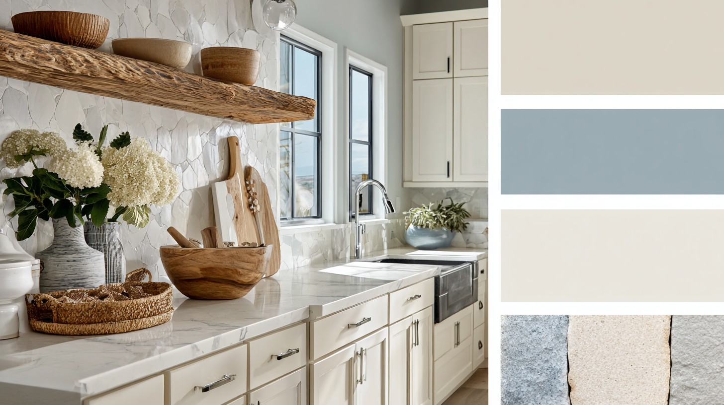
Why Some Rooms Feel Right Without Trying
Some rooms feel calm the moment you enter them.
Others feel strangely tense—even when they’re beautifully furnished.
Paint colors shape mood long before we consciously notice them, influencing how calm, focused, or comfortable a room feels throughout the day.
This difference often has very little to do with furniture or decor.
It comes from something quieter and more foundational: paint.
Paint colors shape the mood of a room long before we consciously notice them. They don’t compete for attention, yet they define how a space feels—emotionally, mentally, even physically. This is why hospitals, boutique hotels, galleries, and thoughtfully designed homes all treat color as a structural decision, not a decorative one.
When paint works, it disappears.
When it doesn’t, the room never quite feels right.
Paint Color Is Not Just Color
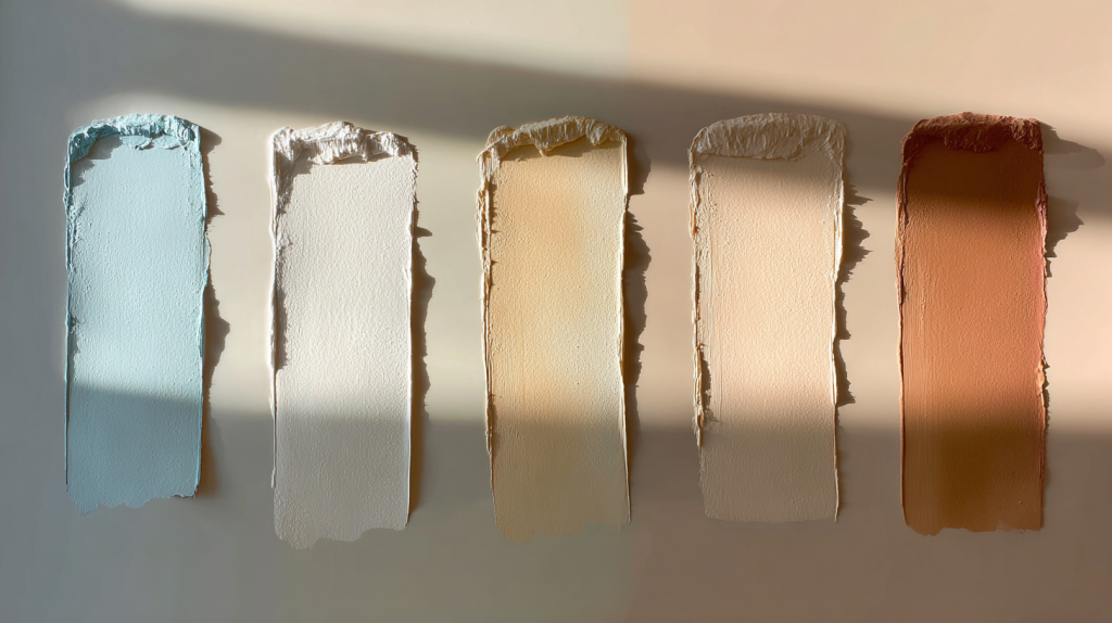
Most people choose paint by color name: white, beige, green, blue.
Designers don’t.
Paint color is made of three interacting elements:
- Hue – the color family
- Value – how light or dark it is
- Saturation – how muted or intense it feels
Two paints can both be labeled “warm beige” and still create completely different moods. One may feel grounded and welcoming. The other may feel flat or dull. The difference is usually undertone and depth—not the color category itself.
This is why so many people repaint a room and still feel unsatisfied.
The color wasn’t wrong—the behavior of the color was.
Paint colors shape mood through subtle relationships, not bold statements.
Why “Warm vs. Cool” Is Too Simple
We’re often told:
- Warm colors feel cozy
- Cool colors feel calm
But context matters more than temperature.
A cool gray in a north-facing room with limited daylight can feel cold and draining. The same gray in a bright room with balanced light can feel serene and modern. Paint reacts constantly to its environment.
What affects how paint colors shape mood:
- Natural light direction
- Artificial lighting temperature
- Wall coverage (entire room vs. partial)
- Surface finish (matte, eggshell, satin)
Color is never static. It changes throughout the day—and so does the way a room feels.
The Most Common Paint Mistake People Regret

The biggest regret after painting isn’t choosing the wrong color family.
It’s choosing the wrong value.
- Too dark → the room feels heavy
- Too light → the space feels empty
- Too neutral → the room lacks presence
Paint colors shape mood through balance. A room needs enough depth to feel held, but not so much contrast that it feels restless.
A helpful principle:
Lower contrast supports rest.
Controlled contrast supports energy.
Color Palettes That Support How a Room Feels

Rather than listing trendy colors, it’s more useful to think in feeling-based palettes. These aren’t about aesthetics alone—they’re about emotional function.
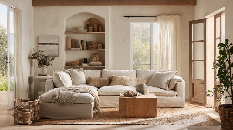
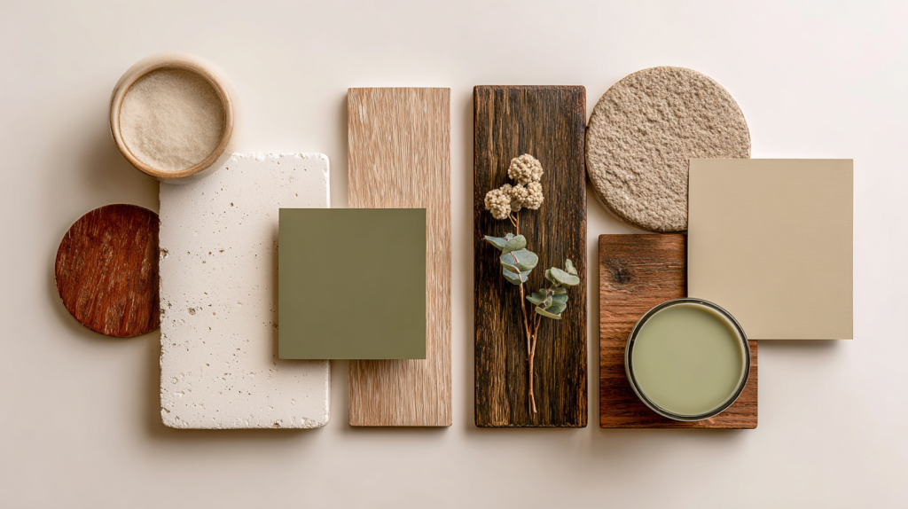
Calm & Grounded Living Room Palette
- Warm off-white (soft, not stark)
- Muted clay beige
- Gentle olive green
- Aged wood brown
This palette lowers visual tension and creates emotional stability. It works especially well in spaces meant for conversation and rest, where no single surface demands attention.
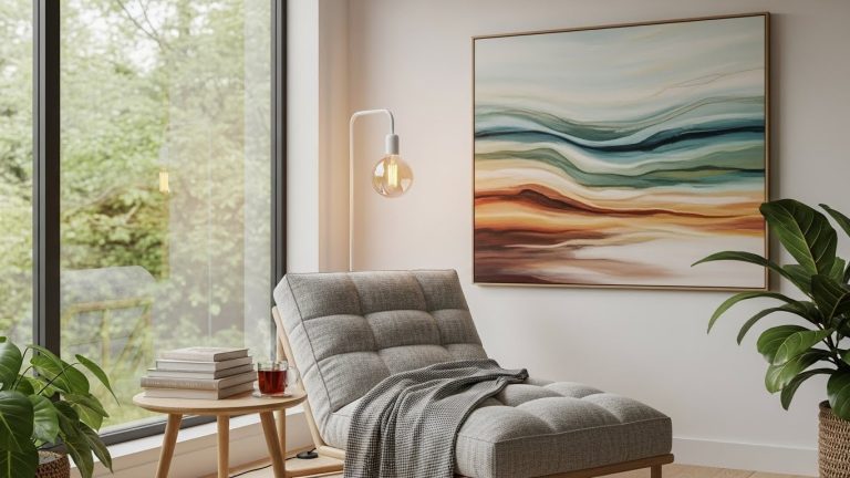
Restful Bedroom Palette
- Soft greige with warm undertones
- Dusty blue-gray
- Faded linen beige
- Shadowed charcoal (very minimal use)
Bedrooms benefit from reduced saturation and softened contrast. These colors help the nervous system settle, supporting deeper rest rather than visual stimulation.
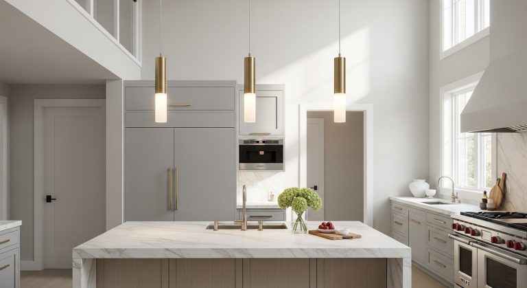
Light but Supportive Kitchen Palette
- Warm white (never pure white)
- Pale sand or oat tone
- Soft gray-green
- Natural wood accents
Paint colors shape mood in kitchens by influencing focus and comfort. Bright enough for clarity, warm enough to avoid glare and fatigue.
Clean but Not Cold Bathroom Palette
- Creamy white
- Pale stone gray
- Soft mineral blue
- Warm neutral tile tone
Many bathrooms fail by leaning too cool. This palette keeps the space feeling clean without becoming clinical.
One Room, Two Different Moods

It’s possible for two rooms with the same furniture to feel completely different simply because of paint choices.
A high-contrast palette energizes but can exhaust over time.
A softened palette creates calm but may feel dull if overdone.
Paint colors shape mood by controlling visual rhythm—how the eye moves, rests, and resets within a space.
This is why good color decisions rarely shout. They guide.
Why Light Changes Everything

A paint color you love in the store can disappoint at home because lighting transforms color behavior.
Morning light reveals undertones.
Afternoon light increases contrast.
Evening light often warms or dulls colors.
Guidance from professional paint brands, including the Benjamin Moore Color Resource Center, highlights how lighting conditions dramatically influence how paint colors are perceived.
Paint colors shape mood differently at 9 a.m. than at 9 p.m.
A good color works across those shifts.
Choosing Paint Colors That Age Well
Understanding how paint colors affect mood helps you choose tones that support daily life rather than simply following design trends.
Trends change quickly. Homes don’t.
Colors that age well usually:
- Have complex undertones
- Sit between warm and cool
- Support changing furniture and decor
This is why nuanced neutrals remain timeless. They adapt rather than dominate. If a color constantly demands attention, it rarely supports long-term living.
Paint as Atmosphere, Not Decoration
Paint colors shape mood quietly. They create the emotional structure behind daily life—supporting rest, focus, connection, and comfort without asking to be noticed.
The best paint color is rarely the one people compliment.
It’s the one that makes a room feel right every day.
If your goal is an inviting home, paint isn’t the final touch.
It’s the foundation.
If you’re thinking about atmosphere before decor, this approach pairs naturally with How to Make a Home Feel Inviting Without Buying Anything New—where space, light, and intention work together.